Sycamore
Skills
Logo design
Visual Identity Development
Product Mockups
Mockups
Process
Overview
The client was Sycamore, a kitchen accessory company looking to market to women. They tasked me with designing their logo. They initially wanted something abstract that included the color orange. They also wanted the logo to convey a sense of professionalism.
Research
For this logo design I started off by collecting images of kitchenware and abstract shapes/patterns. I also looked at various shades of orange.
I found that I liked the more vibrant oranges paired with metallic textures.
Illustration Iteration
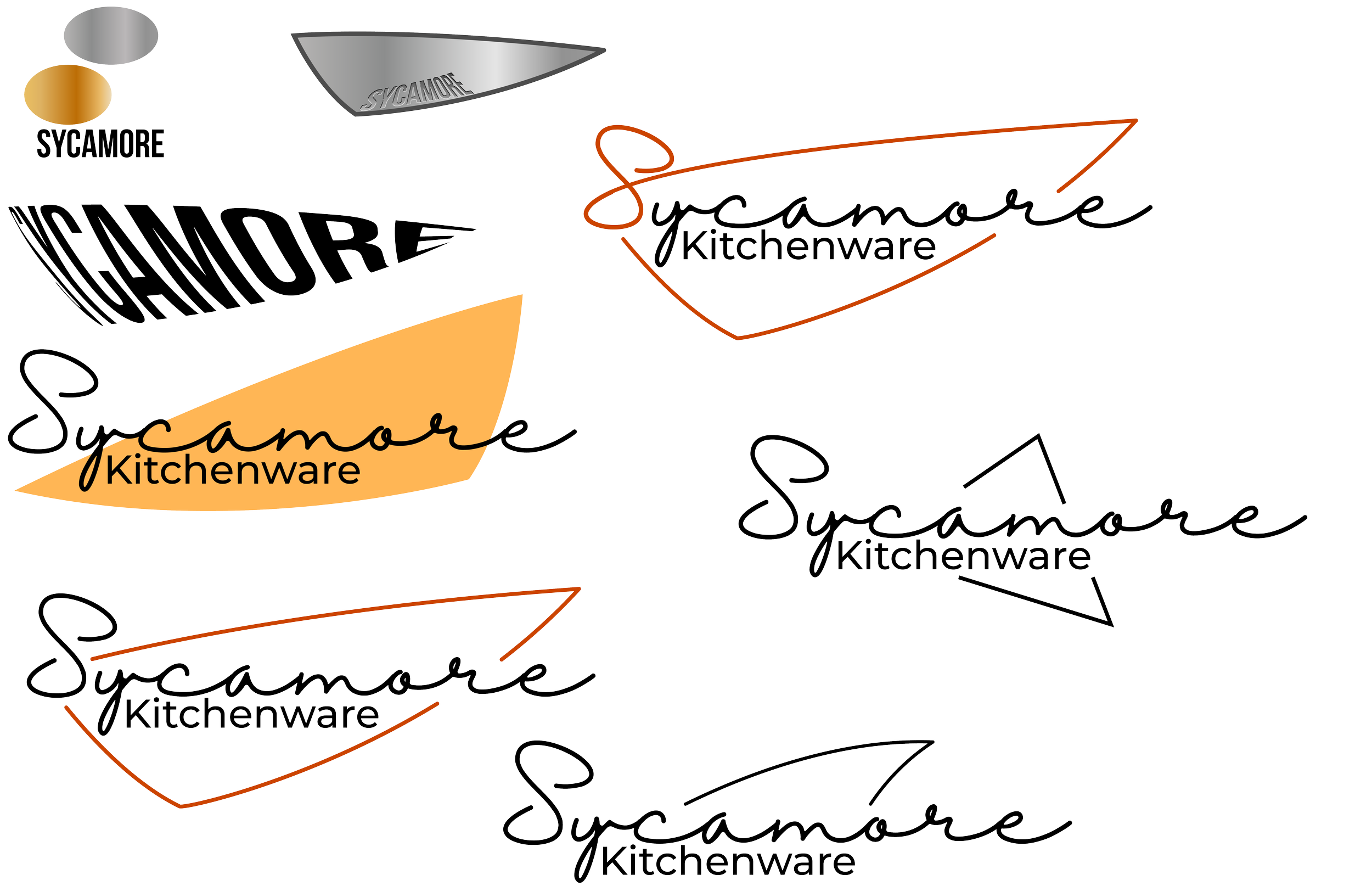
Because the client was looking for a more abstract logo design I wanted to design a shape reminiscent of something you might find in a kitchen. I played with some metallic gradients that reminded me of stainless steel appliances as well as some abstract liquid shapes.
In the end I decided to use the abstracted silhouette of a chef’s knife blade as the base of the logo. At that point I moved on to experimenting with the type.
Logo
Typography
Color Palette


